

Investment opportunities exist all around the globe.
Across more than 40 countries, there are over 15,000 publicly traded companies.[1] If you listen to the news, however, some countries may seem like better places to invest than others based on how their economies and stock markets are doing at the time. Fluctuations in performance from year to year only add to the complexity, providing little useful information about future returns.
Daunted by the prospect of sorting it out, some investors look to the place they know best—their home market. There can be good reasons, such as tax benefits, for prioritising an investment close to home, but too much home bias could mean underweighting or missing out on part of the investment universe.
Australia, for example, represents 2% of the global equity market. An Australian who aims to build a global equity portfolio may have cause for investing a greater amount at home. However, this would come with the tradeoff of reduced investment in other countries. The same is true for a Japanese investor, whose home country represents 8% of the global equity market. Even the US equity market—the world’s largest by far—is only about half of the global opportunity set.
Fortunately, no one needs to be an expert in every region to benefit from the opportunities those regions present. Equity markets process information continuously, leveraging knowledge from millions of buyers and sellers each day as they set security prices. Investors can trust market prices to provide an up-to-the-minute snapshot of global investment opportunities.
Because prices do such a good job incorporating information about securities in every market, they also offer the best prediction of future prospects. No sensible story or compelling empirical research suggests investors can consistently outguess those prices and pick winning countries. A well-diversified global portfolio can help capture the returns of markets around the world and deliver more reliable outcomes over time.
READING THE CHECKERBOARD
The tables in Exhibit 1 illustrate 20 years of annual equity returns for developed and emerging markets. Each color represents a different country. Each column is sorted top down, from the highest-performing country to the lowest.
Taken together, these tables powerfully demonstrate the randomness of global equity returns. In either table, pick a color in the first column and follow it through to the right. Does any country seem to follow a pattern that gives clues about its future performance?
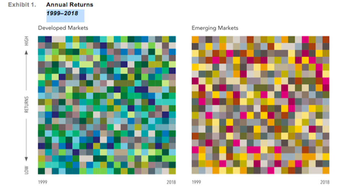
Exhibit 1. Annual Returns
1999–2018
MSCI country indices (net dividends) for each country presented. MSCI data © MSCI 2019, all rights reserved.
Consider the performance of the US and Denmark, shown in Exhibit 2. Is it immediately clear which country had the higher return over the past two decades?
Denmark, in fact, was the best performer among all developed markets, with an annualised return of 10.6%. Surprisingly perhaps, Denmark had the best calendar year return only once, in 2015. The US, despite some strong returns in the last several years, placed ninth overall with an annualised return of 6.3%. Bear in mind, Denmark represents less than 1% of the global market cap available to investors.
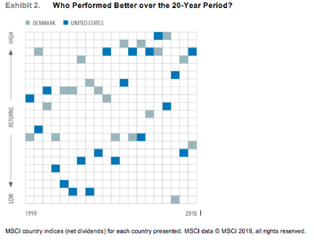
Exhibit 2. Who Performed Better over the 20-Year Period?
MSCI country indices (net dividends) for each country presented. MSCI data © MSCI 2019, all rights reserved.
FROM FIRST TO WORST
Denmark also provides an example of the unpredictability in short-term results. After posting the highest developed market return in 2015, Denmark had the lowest return in 2016. Countries have also moved in the opposite direction, from worst to first, in consecutive years. In 2000, New Zealand had the lowest return among developed markets followed by the highest return in both 2001 and 2002. In emerging markets, Hungary and Russia went from the bottom two performers in 2014 to the top two performers in 2015.
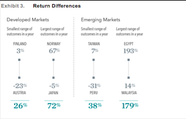
GOING TO EXTREMES
In a single year, the difference between the return of the highest-performing country and the lowest can be dramatic, as shown in Exhibit 3. Among developed markets over the last 20 years, the difference between the best and worst performers has ranged from a low of 26% in 2018 to as much as 72% in 2009. The differences in emerging markets are even more pronounced, ranging from 38% in 2013 to 179% in 2005. In fact, the difference in emerging markets has exceeded 100% in several years.
These extreme differences in outcomes, combined with the examples of countries that experienced sharp reversals in their return rankings, highlight the risk of trying to predict future returns by looking at the past and emphasise the importance of diversification across countries.
NOW, THE GOOD NEWS
This evidence of the randomness in global equity returns, though, is not bad news for investors. Rather than trying to guess which country is going to outperform when, investors committed to a well-structured, globally diversified portfolio are better positioned to capture the performance of the global markets, wherever and whenever it occurs.
A globally diversified approach can deliver more reliable outcomes over time with less volatility than investing in individual countries. This can help investors stay on track, through all kinds of markets, toward their long-term goals.
1) Number of countries and publicly traded companies data provided by Bloomberg.

Find out how we can help you
If you would like to understand more about this topic get in touch
Related posts
 Published On: August 22, 2024|1.4 min read|
Investing in Stocks Versus Hoarding in Savings? It’s All About the Equity Risk Premium (ERP)
Have you ever wondered why investing in the stock market can yield higher returns than just keeping your money in a savings account or fixed-term deposit? The answer lies in the Equity Risk Premium (ERP).
Read more
 Published On: August 18, 2024|1.2 min read|
Inflation Made Real with Beers and Burgers
From 1990 to 2023, the price of a pint of beer in the UK has risen from £1.22 to £4.45, and a Big Mac from £1.40 to £3.69. A clear illustration of how inflation eats into our finances.
Read more
 Published On: August 12, 2024|0.9 min read|
The “Wall of Worry” Timeline
This "Wall of Worry" timeline highlights major global crises from the past three decades. As investors, we often find ourselves concerned about the constant barrage of negative world events.
Read more


